Dyslexic Font
Standard typefaces are often difficult to read for people with dyslexia as the letters are hard to differentiate and words tend to jumble together. Dyslexic fonts provide greater contrast in letters which solves this problem.
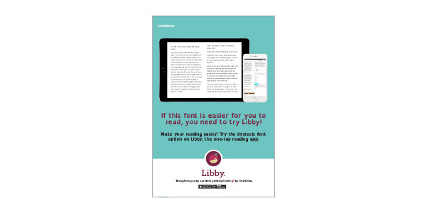
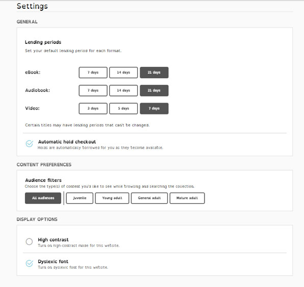
Your digital library website and your app (OverDrive and Libby) feature a dyslexic font option, making determining letters much easier so readers can focus on finding and enjoying their next great read.
On your library website:
In OverDrive Read:
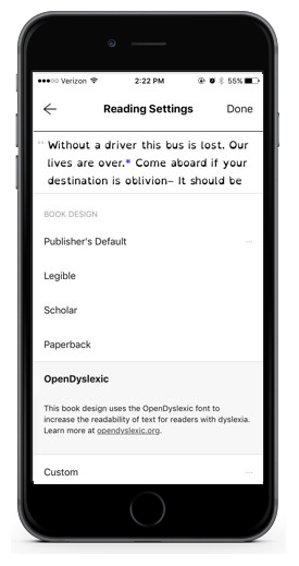
In your app:
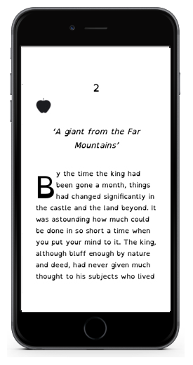
As always, you can also adjust the spacing, font size and screen color to make your reading experience more enjoyable.
